Helpful Hints, Tips and Knowledge About the Real Estate (And Small Business) Marketing Game
Article originally written for a former website
Many people seem to take marketing very lightly in the overall scheme of their businesses. They give no thought to changing colours, fonts, graphic and pictures on their materials each time they begin a new campaign. Little do they know that this can have an effect on marketing your business that is not always positive. This is especially true of real estate agents looking to farm a certain area on a regular basis, creating ad cards, feature sheets, and even photography in their materials. I like to give the advice, keep it simple ... the word "stupid" should fit right in here, but if it's positive results you want, it's best not to call names. Keeping it simple and consistent is the key to marketing in the real estate business, or any other business for that matter. This helps to "brand" yourself, let's potential clients get to know you, and people start to recognize you just by your marketing materials. In this article I've compiled a few points below to steer you in the right direction on your quest to market yourself in this very competitive industry.
Keep marketing materials similar - brand your self.
I see way too many people with different themes on almost all of their materials, pink feature sheets with scroll fonts, black ad cards with Arial type fonts, business cards with red and blue using Times type fonts, and so on, making if confusing to a potential client as to who is offering the service.
Changing a design from one feature sheet or one ad card to the next can be detrimental to your marketing campaign. If people get used to seeing you use the same design, they get to know you by your material, and you become familiar to them, meaning the more likely they will call because they "know who you are". Changing your design, colours, fonts and styles each time you create a new card, feature sheet, brochure etc. just doesn't lend itself to a solid marketing campaign. Unless you are going for a full over-haul of your "look", constant change doesn't make sense if you are trying to let people get to know you and your business through your marketing materials. It would be like dying your hair, and changing your looks everyday - people begin to wonder who you really are. Familiarity in business marketing is very important, and it is how potential customers begin to notice, recognize and become familiar with you and your company.
Use a single feature sheet, listed/sold, brochure, business card, ad card etc. design.
Similar to what was stated above, through the process of distributing ad cards (solds, listeds, coupons, intro cards etc.), people get to know who you are by keeping the same design each time. They see that design and say "oh that's so-and-so" just by the style, fonts or colour on your material that you have been sending to them on a regular basis. This helps with recognition of your name in your particular field of business, especially in the real estate sector. If you changed your design each and every time, you loose that ease of recognition, especially since a good many of these types of marketing materials go straight into the blue box, leaving you with only seconds for the potential client to take a fleeting look at the item. The consistency of cards that you are sending out allows for recognition in the second before the item is tossed. This is extremely important to remember when creating distributed advertising material.
Feature sheets should be designed once, as a template, and that design utilized for all of your listings. There are certain instances that a larger, more detailed sheet may be needed (Ie. For homes over $1,000,000), however, all that is necessary is to tweak your original design to fit a new sheet. Keeping the same design makes things simpler for you, easier for the client to understand, and creates a more professional look - something that you can take to an initial meeting of a potential client and say "this is what I have to offer" without having to fumble through samples, looking for a new design, seeming as though you haven't a clue what you're doing in that regard. I like to recommend sticking to either the 11"x17" folded style, or the 8.5"x11" front and back. Both of these can be made to look very professional, stylish and can be made to follow the same themes as your other advertising material. The former be used for a more detailed sheet, for a home with many upgrades or features to talk about, while the latter can be used for simpler homes, focusing on photos rather than wording, keeping both in the same style as each other, making them interchangeable, but easily recognizable.
Keep it simple.
Bogging down advertising with too many words looses peoples attention. Simple statements like "Sold in 1 day for 99.9% of asking", "We're here to help" or "Call for an estimate" are simple, to the point, and grab attention. Writing paragraphs and adding to much information to an ad card results in loss of interest, and the material being discarded without even being looked at. No one wants to spend hours reading about your house sale, your business plans or every single service that you offer on an ad card. Straight forward, to the point and simple is the best plan to follow. Catch their interest with your initial statement, and then draw them in to either your phone number or your website where they can find out more information. I find drawing potential clients in to your website the best way, as they feel no obligation when going to a site, they are more at ease, there is no pressure and they can find out all about you, your business and what you have to offer on their own. Yes, there is the risk that you may never make contact with them, however that is a risk that you must be willing to take.
Brochures and other such material that you plan on distributing or handing out should follow the same lines as above.
CMA information should be simple, informative and interesting to the potential client.
CMA's really don't have to be 50 pages long and presented like a novel. You are not trying to sell a publisher the next best selling non-fiction, you are tying to convince your potential client that you would be the best fit for their needs. Make them simple yet informative. Outline what you specifically have to offer, talk a little about you, about the company you work for, and some stats that prove your worth. Include a sample of the marketing material (feature sheets and ad cards) that you produce that are relevant to that clients area. Use images! Images catch and hold attention longer that row after row of text, but, of course, you must use relevant high quality photos or artwork that will attract your client.
Have a CMA designed that you can print for yourself or something more generic that you can keep copies of for when you need it. Relying on others to print your CMA for you can leave you stranded when you have a last minute presentation at 4:00pm on a Sunday.
Keep your CMA design similar to the rest of your marketing material. This helps to tie your while business together, shows professionalism and makes things simpler for you. Bind your CMA for the presentation or have it presented in a folder. Know where the pages are that you will talk about to the potential client. This keeps things organized, proficient and makes you look like you know what you're talking about, which is a very important first impression.
Full page flyers are too much reading.
Full page flyers and newsletters (8.5"x11") tend to be to much reading for farm areas and potential clients. If sending newsletters out is part of your farming routine, add some statistics for the area. People who are even remotely thinking about selling their home will be very interested in statistical information specific to their area. If sending out full page flyers is part of your routine, to catch attention, showcase all of the homes that you have sold in that particular area. Make it very picture heavy so that there is not a lot of reading to do. On both types, ensure that your name is large, bold and easy to read, along with your picture (if you use it in your marketing material). Once again, keeping with the same suggestions as above, keep these items similar in design to your other materials for ease of recognition.
Black and white versus colour.
Statistics prove that colour advertising is much more effective and eye-catching than black and white. However, colour can be very pricey, especially when you are working a farm area on a continuous basis. Because of this, you need to keep in mind that 95% of the ad material that you send out gets immediately tossed into the recycling, regardless if it's colour or black and white. So a well-designed black and white piece might be more feasible in certain situations and if money is an object in your marketing campaigns. Something with your name very prominent (preferably white on black), your website, brokerage/business name and contact information all legible, but kept in the same style as the rest of your materials. This way you save money, but you are still getting your name out there, relying on the similarity of your material for that 1 second of recognition time before you-know-what happens.
Paper ads that don't tie in.
Many newspaper real estate advertisements or small business ads in general don't flow or keep together as they should. The header of the ad ends up looking like a totally separate entity from the body, causing confusion for those perusing the publication. Try and have your ad designed so that it looks like it's tied in altogether, and that it doesn't belong to the persons ad beside or under you. Use a single colour boarder to "contain" everything, one that matches the header, or a single background colour that is similar in keeping with the rest of your marketing material, again matching the header of the ad.
Have a professional or someone who knows what they're doing take photos for you.
There is nothing worse for a buyer than looking for listings on the MLS, or a client searching through a catalogue and the photos are poor quality, too dark, grainy, focusing on the wrong subject, showing only a couch or a bed, etc. (remember real estate agents, you're trying to sell the house not the furniture). People get turned off a listing or product when they see that type of poor quality. Spend the little bit of extra money and have someone who knows what they're doing take the photos for you. Too many self-shot home photos are dark, dreary, leave the house looking small, and not attractive, in turn, making your brochures and feature sheets look very unprofessional. This is not how you want your clients home to come across to potential buyers.
If you insist on taking your own photos NEVER have the date stamp on while photographing. Make sure that you have a adequate flash. Never shoot towards a window, that creates a backlit image, and the window becomes very bright, and the rest of the room very dark. Try and do the shoot in daylight hours, preferably when it's nice and bright out, and turn the lights on in the house, even if it is during the day. Keep in mind however, that incandescent lights throw yellow, so may affect the colour of your images. Never ever take pictures with your blackberry or any other low resolution camera. Point and clicks are great, but when you want a professional looking photo, nothing beats a digital SLR.
Website - why, what, who?
Now-a-days, with so many people constantly connected to the web, it is a very good idea to have an up-to-date, informative, eye catching website for potential clients to visit. Your website should be highly visible on all of your marketing material. Your website should be easy to navigate, and be kept up to date on all your current listings, solds, products, sales and other pertinent information. People like to do their own research before they decide upon an agent, a house etc. so having a website allows potential clients to check you out before they contact you. Hence the reason to keep the site up-to-date at all times (a good idea is to have a date stamp that is posted on your home page, informing clients as to when the site was last worked on and up-dated. There is nothing worse then visiting a site for a business you are interested in, and finding that it hasn't been updated since 1995. Make sure that all page links are working, and test this on a regular basis. If your internal site links don't work, and no one can negotiate your pages, there is no point in people visiting it, and it is very frustrating for those who are interested in what you have to offer. Keep the site in the style of your marketing material (if you can) so that they recognize who you are when they visit. Use high quality images for your site, and if possible, have a professional create it for you - they know sites in and out, how to optimize it for searches, what placements work best and where, and will give you a unique, interesting site that potential clients will be happy to view. An eye catching, information filled website can work wonders for a business now-a-days.
Over all, whether you are marketing yourself, a service, a product, your business etc., it is imperative to keep things simple and similar. Recognition is key, especially in the real estate industry, and when you create marketing materials that are of the same style each and every time, you gain that recognition, in turn allowing people to "get to know you" through the items that you distribute. Once people "get to know you" they become more comfortable with you or your business, and are that much more likely to choose you over the other business who isn't following this same procedure.
Julie Deans © May 2008
Julie Deans is an artist, a honours graphic design grad, the owner of Chickadoo Expressions (design & photography), and has many years of experience working in the real estate design sector as well as the administrative field. She utilizes the knowledge she has gained through her experiences by writing articles in hopes to help others gather information and become more successful in their careers, or business ventures.

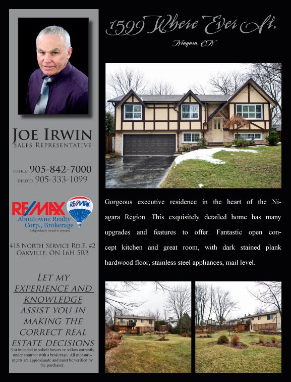 Single page, 8.5"x11" front and back feature sheets are the way to go for smaller listings such as condos, town homes or semi-detached. You can still display enough relevant information and images, as well as having an eye-catching design, all while keeping your marketing costs down. Add your MLS listing for the complete package to ensure that you clients and potential buyers get all of the important information.
 Use Chickadoo Expressions to design your marketing material. Excellent prices, great turn around times and friendly, knowledgeable service. www.chickadoo.com


